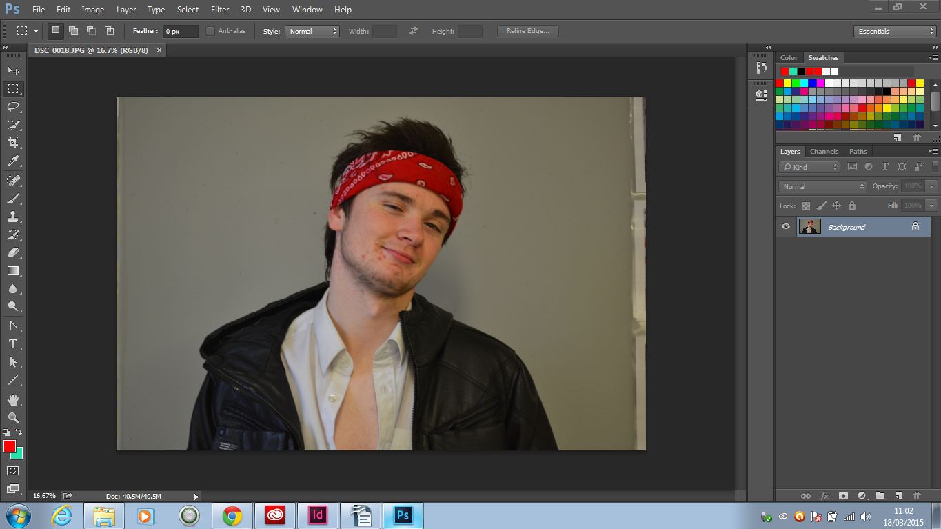
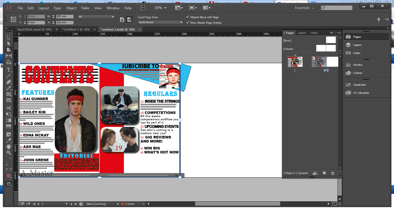
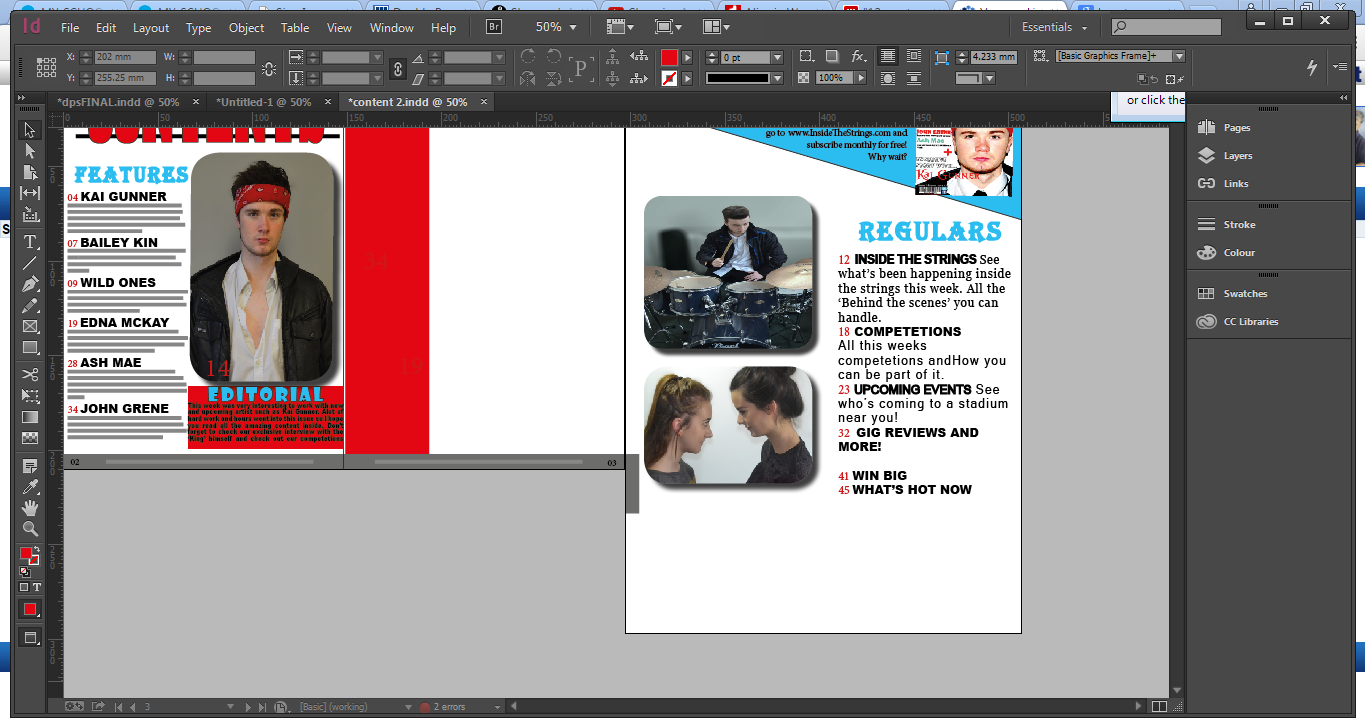
The images above are taken from my magazine and Kerrang(left). I believe Kerrang represent similar social groups as my magazine does so I chose to comment on these two photos.
Posture
In terms of posture the images are fairly different. In my image the model is very straight and upright, his head is aligned with his body to create a very straight and narrow posture. This gives a sense of seriousness and directly addresses the audience. The image from Kerrang however the guy is hunch with his hands in his pockets and his head slightly titled which isn't very serious, he us more casual and confident. This is expected considering Kerrang can be confident as they are already famous where as mine being a new magazine I thought it was important to make a good first impression.
Clothing
The clothing is pretty similar, especially when focusing on colours although picking up on my last point it is very clear that by wearing a casual t-shirt with his tattoos showing Kerrang's model needs little effort as they are already established famous. In my image however the model is wearing a leather jacket and white shirt along with a red bandana. This is a very elaborate attempt to try and connect to the indie-rock side of things.
Shot Type/ Angle
Now this is where the images start to look more alike. Both images were shot as mid shots which was to let the audience see exactly the artist in their full glory. Both shots are highlighting the artists and show the artists looking directly at the camera for a sense of power, now here is where they differentiate; In my image the shot is at eye level setting a sense of equality between the reader and artist whereas in Kerrang's image the artists is shot looking down upon the reader. This gives a sense of power to the artist over the reader.
Now in terms of representing social groups I think my magazine does so fairly. The women shot in the magazine are going head to head and it gives the 2 women a sense of power whereas most magazines rarely even feature women. As my target audience is aged between 15-25, my readers will tend to be pupils in school, students in university or young professionals so with this in mind, by using the grade definitions I can see that my music magazine will appeal to those in categories B, C1 and C2. On top of that the colour scheme employed throughout the magazine and indeed the house style also help to represent and target particular social groups and target my audience. I used a rang of colours including red and blue. These colours are the 2 most basic colours and can be associated with women and men therefore I am constructing a representation on social groups.