Showing posts with label Construction. Show all posts

Thursday, 19 March 2015

Re-Drafts

This is my re-draft for Magazine cover, I completed this on Photoshop. I tried to maintain a house style across all products as challenging as that proved to be. 
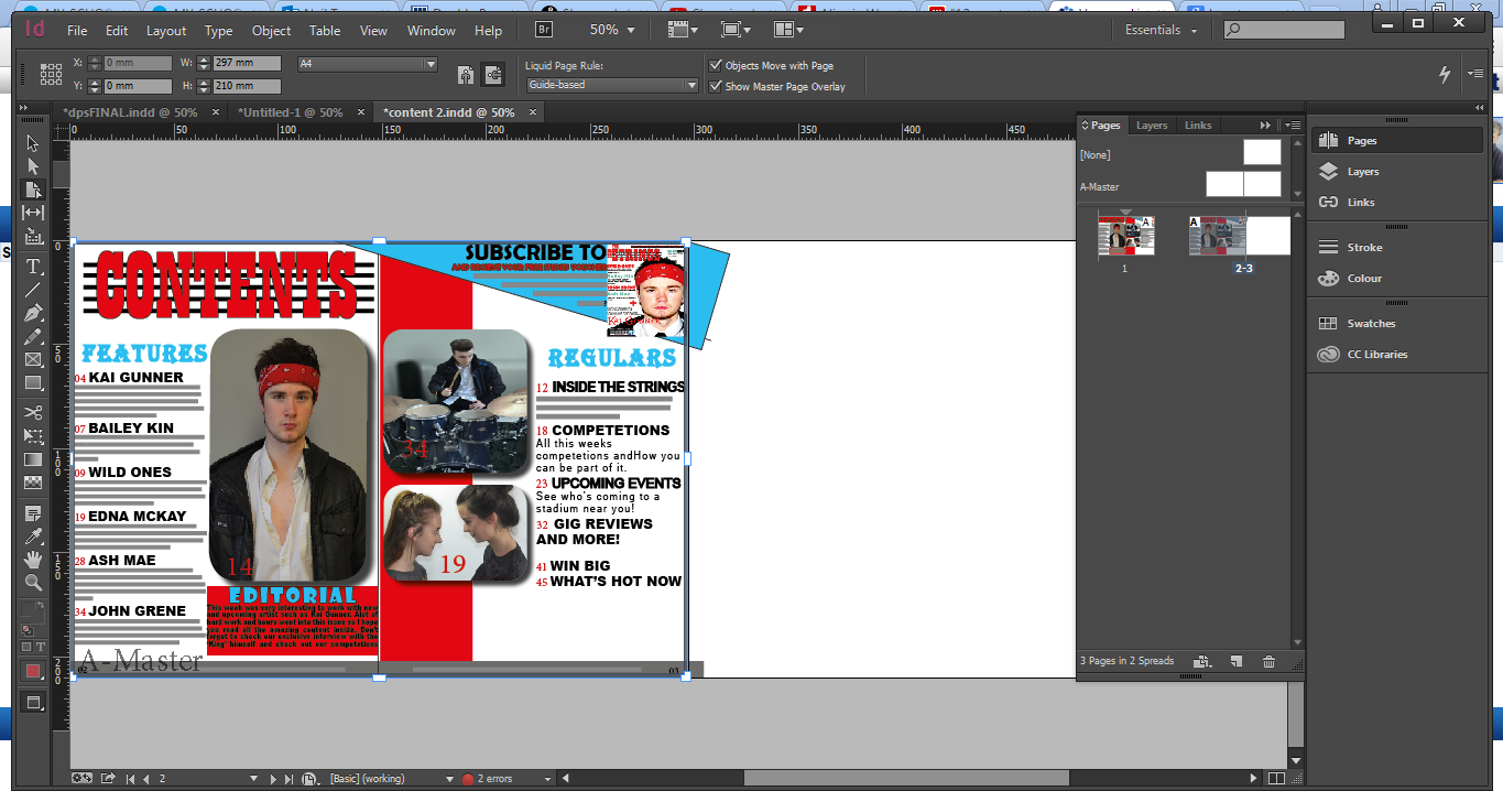
My contents pages and double page spreads were both created on InDesign. As previously stated I attempted to create the best house style that I could.


Re- Drafts


Double Page Spread Construction


Content Construction

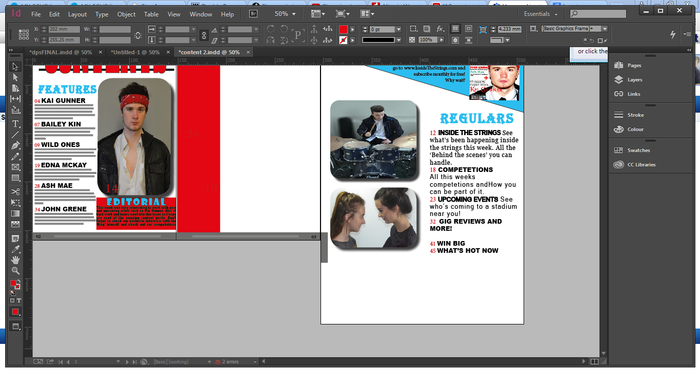
For my content re-draft I included a review section. Which was based upon a concert I went to so I also edited and used an image I took while attending the concert.

The first thing I done in my re-draft was making the decision to use 2 portrait pages instead of 1 landscape page.
Then I began to add everything from the previous draft onto the second page.


Cover Construction

When fixing up my Cover I decided to convert to Photoshop as it would be easier to move all the features added around. At first I decided to fix up my barcode and create a new one using an online barcode generator.
Next I wanted to follow shared conventions of all magazines, especially Q magazine. Which is why I added the plus sign, however I had to paint this red.

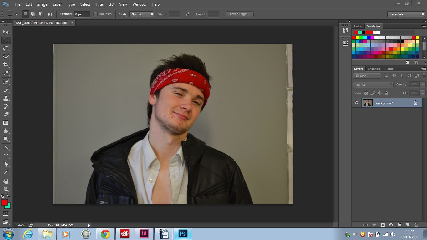
The image I used is the image below which was edited on Photoshop, the reason I did not screen shot this was because I only edited the brightness.


The icons below were all downloaded of the internet and re-sized to be placed next to the barcode. This is also follow typical codes and conventions used by other magazines all over the world. These are used to advertise the social media used by the magazine.

At first I planned to use standard fonts in Photoshop although after further research on other magazines I noticed that the main artist's name has to stand out so I visited Dafonts.com and got the font below.


Wednesday, 11 March 2015

New Drafts Ideas

I have come up with a couple of ideas for my re-drafts of all my music magazine products. These ideas were based upon audience feedback and extensive research I done on other media products.             

Cover:
  • I am considering adding a Skyline based upon feedback from my teacher who suggested it would help the magazine follow codes and conventions of other media products.
  • The barcode needs to be smaller and less pixelated, the barcode should never be more than around 3-5% of the whole page.
  • I need to add more cover lines as my Cover looks a little dull which is a major disadvantage when creating a magazine as the cover will be the selling point or the first thing anyone will see in relation.
  • After looking at other magazines I have decided to change my font to better suit the indie rock genre conveyed by the magazine. Especially for the main cover line where the artist is featured(name).
  • The image itself needs to be replaced as the image used is very dull and the black and white does not help to add excitement or vibrant colour to the magazines cover.
  • Add the very popular '+'

Content:
  • The layout itself needs to be better in general as there is too much white space and the two pages are lacking.
  • In regards to the font I plan to apply the same rule as mentioned above for the cover.
  • Block letters seem to be a very commonly used font style or word style in contents page, I myself like the look of this.
  • Add the same slogan from the cover under the title 'contents' to build a better house style and of course a more distinguishable overall look.
  • More stories under the 'regulars' section and change the stories under the 'features' section to artist names only and a blurb about that artist or article.
  • Consider adding a thumbnail of the cover.


Double Page Spread:
Single Page(intro page);
  • Image that relates better to article and an overall better look image as the photo does not cover the full body of the model etc.
  • When changing the front cover font also change the font on the single page for 'Kai Gunner' to convey my house style further.
  • Depending on the images I previously took I will attempt to convert the single page into a full page image
  • Another possibility would be to do four pages of a double page spread.


Spread(the double page);
  •  The changes made for the spread will all depend on the changes made to the single page.

Thursday, 26 February 2015

Double Page Spread

This was the outcome for my first draft, being the first draft I knew there would be lots of changes and tweeks to make on this. I will now get feedback on my DPS from a fellow classmate to know which changes to make.


DPS construction (first draft)

Creating my Double Page Spread was difficult, therefore I knew a tutorial or some sort of help was required, therefore I decided to watch videos on Youtube to help me learn the basics of creating the Double Page Spread.

This video was particularly helpful as it was very helpful in getting started and covered even more than the basics.

Secondly I started to write up my article that I was going to feature. This wasn't too challenging as I was used to this style of writing in english.

The style of article I decided upon was an interview based on a series of questions. These questions were all music related whilst trying to grasp the readers attention.

Then I went on to create the magazines itself: I started with the facing pages and 3 columns to match the shared conventions of all magazines. 
 Secondly I added my images directly from my documents. I aligned these images the way I wanted them, this made it easy to know the direction of my font and where I had to place.
 Lastly I decided a title page would add a better appearance to my Double Page Spread and act as an introduction the main thing.

Friday, 13 February 2015

Contents Page 1st draft

This is the first draft of my contents page I tried to leave a lot of white space so that the page would look tidy but I think there is too much white space which I will need to correct. I put it together on inDesign and used Photoshop for the images. Seeing as this is only my first draft I will receive audience feedback and make another draft upon making my final draft.

Content Construction

These are the steps I went through to edit the main image of my content page. I used Photoshop although I will be using inDesign to create the contents page. This image features the same artist featured on my front cover. The main changes I made were lens blur for the back ground and of course cropping the image.

Tuesday, 10 February 2015

Inspiration for Double Page Spread

These are a few snippets I took from various magazines as a bit of inspiration. These include pull quote and drop caps which follow typical shared conventions of all double page spread.

 Byline: used to familiarize the audience with those involved with the construction of the magazine.

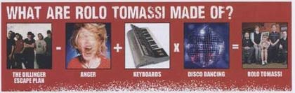
 I found this on one of Kerrang's magazines and thought it was a good idea. It is used to show the readers what the artist featured in DPS is made of or what their interests are.
 Drop Cap: used to draw attention to a particular section of the Double page spread or commonly used as a starting point of an article.

This is a pull quote, used to give an insight to the article. These are interesting as they give a little extra information as to what the article is about.


 In terms of photographs, sizes, shapes, colours etc. can vary quite often. The two images i have featured may look the same but are significantly different. The first on the left covers two pages which for me may not be a good idea considering my artist is a single artist which means the image would have to be spread along two pages. The one at the bottom however covers 3 quarters of the 2 pages. This takes up a lot of space and leaves no room for writing, although the writing could be brought forward and laid on top of the image. These are the little things that may be featured in my Double Page Spread and the decisions I must make.