
Friday, 13 February 2015
Contents Page 1st draft
This is the first draft of my contents page I tried to leave a lot of white space so that the page would look tidy but I think there is too much white space which I will need to correct. I put it together on inDesign and used Photoshop for the images. Seeing as this is only my first draft I will receive audience feedback and make another draft upon making my final draft.

Content Construction
Tuesday, 10 February 2015
Inspiration for Double Page Spread
These are a few snippets I took from various magazines as a bit of inspiration. These include pull quote and drop caps which follow typical shared conventions of all double page spread.
 Byline: used to familiarize the audience with those involved with the construction of the magazine.
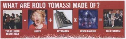 I found this on one of Kerrang's magazines and thought it was a good idea. It is used to show the readers what the artist featured in DPS is made of or what their interests are.

 Drop Cap: used to draw attention to a particular section of the Double page spread or commonly used as a starting point of an article.
This is a pull quote, used to give an insight to the article. These are interesting as they give a little extra information as to what the article is about.


In terms of photographs, sizes, shapes, colours etc. can vary quite often. The two images i have featured may look the same but are significantly different. The first on the left covers two pages which for me may not be a good idea considering my artist is a single artist which means the image would have to be spread along two pages. The one at the bottom however covers 3 quarters of the 2 pages. This takes up a lot of space and leaves no room for writing, although the writing could be brought forward and laid on top of the image. These are the little things that may be featured in my Double Page Spread and the decisions I must make.
Byline: used to familiarize the audience with those involved with the construction of the magazine. Drop Cap: used to draw attention to a particular section of the Double page spread or commonly used as a starting point of an article.This is a pull quote, used to give an insight to the article. These are interesting as they give a little extra information as to what the article is about.
In terms of photographs, sizes, shapes, colours etc. can vary quite often. The two images i have featured may look the same but are significantly different. The first on the left covers two pages which for me may not be a good idea considering my artist is a single artist which means the image would have to be spread along two pages. The one at the bottom however covers 3 quarters of the 2 pages. This takes up a lot of space and leaves no room for writing, although the writing could be brought forward and laid on top of the image. These are the little things that may be featured in my Double Page Spread and the decisions I must make.
Tuesday, 27 January 2015
Second draft for front cover
Based upon the audience feedback I received and criticism from my teacher, I knew what changes I had to make. I myself knew what changes I had to make for my magazine to be remotely close to the standards of magazines such as Q. I used indesign to put the magazine together and also for the fonts used.

Audience Feedback
In my media class I left my first cover draft on my screen and left a page entitled audience Feedback. Each member of my class came around one by one and give their honest feedback. I now know what I need to change for my second draft.


My First Draft for Cover Page
This is my first draft for the cover of my music magazine. I used photoshop to edit the image used and used indesign to put it all together. In regards to the font and coverlines used they are all a guide or a trial run so that I can recieve feedback and make changes.

Step by Step Editing of my front cover image
The editing process for my front cover image was done on Photoshop. I took screen grabs of what I done and used Slideshare to present my work however I created the presentation in Powerpoint.
Subscribe to:
Posts (Atom)