When fixing up my Cover I decided to convert to Photoshop as it would be easier to move all the features added around. At first I decided to fix up my barcode and create a new one using an online barcode generator.
Next I wanted to follow shared conventions of all magazines, especially Q magazine. Which is why I added the plus sign, however I had to paint this red.
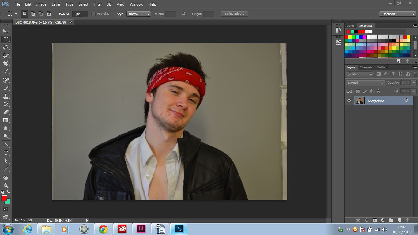
The image I used is the image below which was edited on Photoshop, the reason I did not screen shot this was because I only edited the brightness.
The icons below were all downloaded of the internet and re-sized to be placed next to the barcode. This is also follow typical codes and conventions used by other magazines all over the world. These are used to advertise the social media used by the magazine.
At first I planned to use standard fonts in Photoshop although after further research on other magazines I noticed that the main artist's name has to stand out so I visited Dafonts.com and got the font below.