
Tuesday, 27 January 2015
Second draft for front cover
Based upon the audience feedback I received and criticism from my teacher, I knew what changes I had to make. I myself knew what changes I had to make for my magazine to be remotely close to the standards of magazines such as Q. I used indesign to put the magazine together and also for the fonts used.
Audience Feedback
In my media class I left my first cover draft on my screen and left a page entitled audience Feedback. Each member of my class came around one by one and give their honest feedback. I now know what I need to change for my second draft.


My First Draft for Cover Page
This is my first draft for the cover of my music magazine. I used photoshop to edit the image used and used indesign to put it all together. In regards to the font and coverlines used they are all a guide or a trial run so that I can recieve feedback and make changes.

Step by Step Editing of my front cover image
The editing process for my front cover image was done on Photoshop. I took screen grabs of what I done and used Slideshare to present my work however I created the presentation in Powerpoint.
Friday, 16 January 2015
My images and feedback
These are my photos for my music magazine, I used padlet to recieve audience feedback. The reason I did this was so I could determine the ones in which my target audience would prefer. I used padlet as it is just free of hand to do whatever the audience want. unlike long boring surveys.
Friday, 9 January 2015
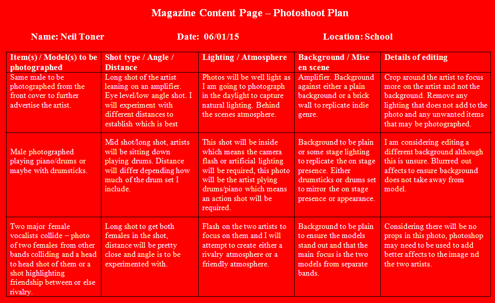
Photoshoot plans
These are my photoshoot plans for my Cover page, Content page and Double page.
Cover page

Content page
 Double page spread

Cover page
Content page
Monday, 5 January 2015
DPS flatplans
Both of my double page spread flat plans are based upon magazines I previously analysed. This was because it would guarantee that my layout would be professional and would follow common shared conventions of other big magazines double page spreads.
The headline for this DPS is situated differently to the normal titles that are usually located to the right page. The headline will be a quirky name for the article in relation to both the main cover lines sown on the cover and content pages. The headlines will also be very large and will mirror the same font used for the title of the contents page. The main image will take up the majority of the second page and will feature the same artist photographed on the cover. Like all magazines each page will have 3 columns of text. The extra images added are to show the artists more in depth and help readers relate better to him.


Content page flatplans
These are my 2 flat plans for the content page of my music magazine. These ideas are basically to show my ideas and the process I am going through in deciding the finished product.
1.

To the right I decided to put the list of contents featured in the magazine along with the page numbers and a little blurb to make the titles more attractive whilst determining an independent look for each headline. This attracts readers to read more into the magazine and acts as a further enticement .
The title will be situated at the top and aligned to the left which ofcourse makes it easily distinguishable that this is the content page. This will be very large and will be similar to my masthead. By doing this I am initially creating a house style for my magazine.
The main image used in the content page will feature the same artists photographed on the front cover(main image). This will further advertise the artist and show the readers his importance to the issue.
2.

One major difference however, is the special feature and regulars section. These will be located as seen to the left and will be loaded with content. Special features meaning content based upon this issue or specially created to support the genre used where as regulars will be the usual content found in my magazine. Also in this flatplan I decided to lean more in the favour of my target audience. In my target audience questionnaire I fond that the majority of those willing to read my magazine
Flat plans for cover of magazine
Below are my two flat plans for the cover of my magazine. Both flat plans are possible layouts of my magazine or guidelines to construct the final product.
1.
The masthead for this flat plan is typical masthead positioning and alignment. This particular flat plan was based upon typical magazine conventions used by all magazine. The position of the masthead also attracts the readers eye flow and gives a better layout to the cover. The reason for the masthead being situated as such is for the ease of access in any store magazine stand and will act the magazines selling point. As for the font etc my masthead was created on Photoshop and will be shown in the construction of the magazine.

The main image will consist of an image of an artist I photograph. The image will also follow common conventions used by all magazines across the globe, it will take up to 85% of the page and will most likely be a mid shot. The main image will not act as a background in this flat plan as I decided to leave white space for professionalism in this layout.
For the cover lines I will focus more on the language used considering there are no images to entice readers or eye flow for that matter I will have to use informal language to suit my target audience.
As for the puff, it will be situated overlapping the main cover line and main image. I will use this as a unique selling point for my magazine and will definitely attract eye flow(who doesn't like free stuff).
The bottom right corner once again will follow with common conventions used by all magazines, this will be the barcode, date etc. etc. Being such a minor feature it is vital to use up as little space as possible while maintaining an easily distinguished layout.
At the bottom center I will add in a thumbnail image of an artist with a cover line. This will be too add extra features to the cover and make the magazine appear as though it has lots to offer and is full of content. Also it adds a better less dull look to the whole cover.
2.
The masthead for this flat plan is a little more thinking outside the box. I decided to rotate this to coincide with my homemade masthead. This masthead will grab the readers attention as the layout is slightly different to main magazines, however the positioning itself was an attempt to mirror the masthead used by Q magazine.
 For this flat plan I used a little + sign to connect the main cover line with the other cover lines.
 I also used a pull quote in relation to the main cover line to further promote readers and attract them to the main cover line.
The layout itself differentiates slightly from the one above, however as for the rest of the ideas and features mentioned for flat plans, they are listed below and support this flat plan also.
Sunday, 4 January 2015
My Music Magazine Moodboard
This is a short video showing the genre in which my music magazine is based upon. I did this video to give my target audience a preview of what the magazine will contain. The genre I chose is shown well in this video. The format I used for this video was Animoto. Animoto is very simple to use an is good for future use in the construction of my magazine.
Subscribe to:
Posts (Atom)